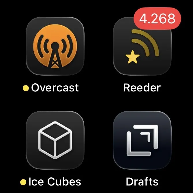
while using a dark homescreen theme on my iphone for the first time, i remembered reading a headline about crooked or tilted icons in ios 26 a few weeks ago, and now i know what that was about, but it’s nowhere near as bad as described.
the new icon outline introduced in ios 26 really makes icons look crooked when using dark backgrounds. you can tilt your phone to change the effect, but most of the time it defaults to opposite app corners being highlighted (screenshot 1).
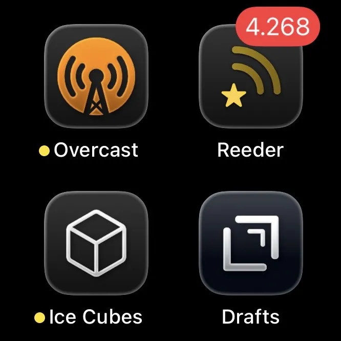
when holding the phone in a certain angle, you can see the new outline around the entire icon. while it still doesn't look perfect, it certainly looks better (screenshot 2).
also, when changing accessibility settings1 to ‘reduce motion’, it just stops the motion of the outline, keeping it on the before mentioned corners. this is making it worse, as it stops moving at all.